Brand & Content Designer

 Logo & Branding  ›  G-Fit

G-Fit.

Fitness app brand identity & visual direction.

Brand Identity
Logo Design
UI Direction
Campaign Design
G-Fit
Fitness app · Train smarter, live stronger
Client
G-Fit
Industry
Fitness & Health Tech
Scope
Brand Identity, Logo Design, UI Direction, Campaign Design
Deliverables
Logo, App UI Direction, Campaign Visuals, Apparel
Overview

G-Fit is a modern fitness app built around helping people train smarter, build better habits, and become stronger.

The Identity

A visual identity that combines strength, energy, technology, and discipline.

The System

A bold black-and-green color system, a geometric logo, and a high-impact visual style.

Foundation

Black

Discipline and focus.
#0A0A0A
Energy

G-Fit Green

Movement, progress, technology.
#53B960
Clarity

White

Simple, clean contrast.
#FFFFFF
01
The Logo

Built around strength
and movement

“A bold, energetic mark that feels connected to movement and progress.”

The G-Fit logo uses a geometric form to create a bold, energetic mark that feels connected to movement and progress.

The combination of green and white against black gives the identity a strong digital presence while keeping the mark simple enough to work across different applications.

Strength
Solid, geometric form
+
Movement
Forward-pointing energy
The G-Fit mark
02
The Visual Direction

Strong visuals.
Stronger message.

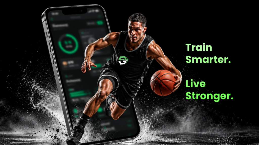
The brand uses high-contrast imagery, dramatic lighting, and athletic compositions to communicate the energy behind the product.

The visual language is designed to feel focused, powerful, and contemporary — matching the mindset of someone who is serious about improving their fitness.

High contrast
Dramatic lighting
Athletic energy
Focused mindset
03
The App Experience

Designed for everyday progress

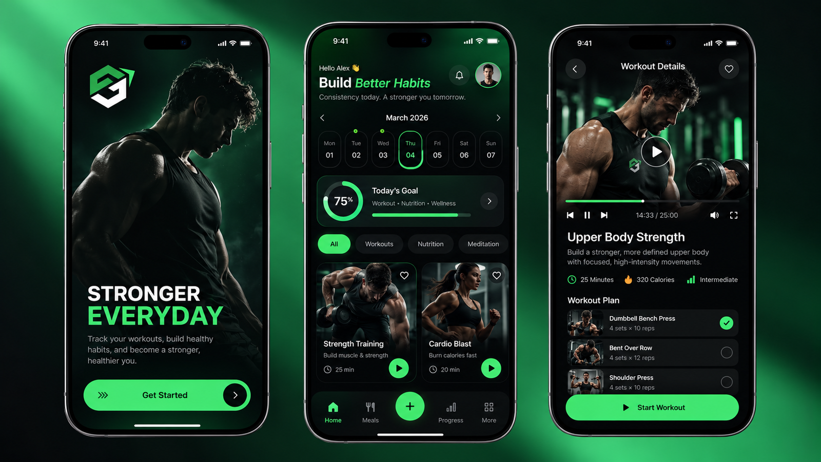
The visual identity extends naturally into the product experience — the same dark foundation and vibrant green accents connect the brand and the digital product.

Dark foundation
Keeps the focus on content and training.
Vibrant green accents
Highlights actions and progress.
Clear hierarchy
What matters is always easy to find.
Bold typography
Training, tracking, and progress up front.
04
Brand in Motion

From the gym
to the screen

One visual system, recognizable wherever the brand appears.

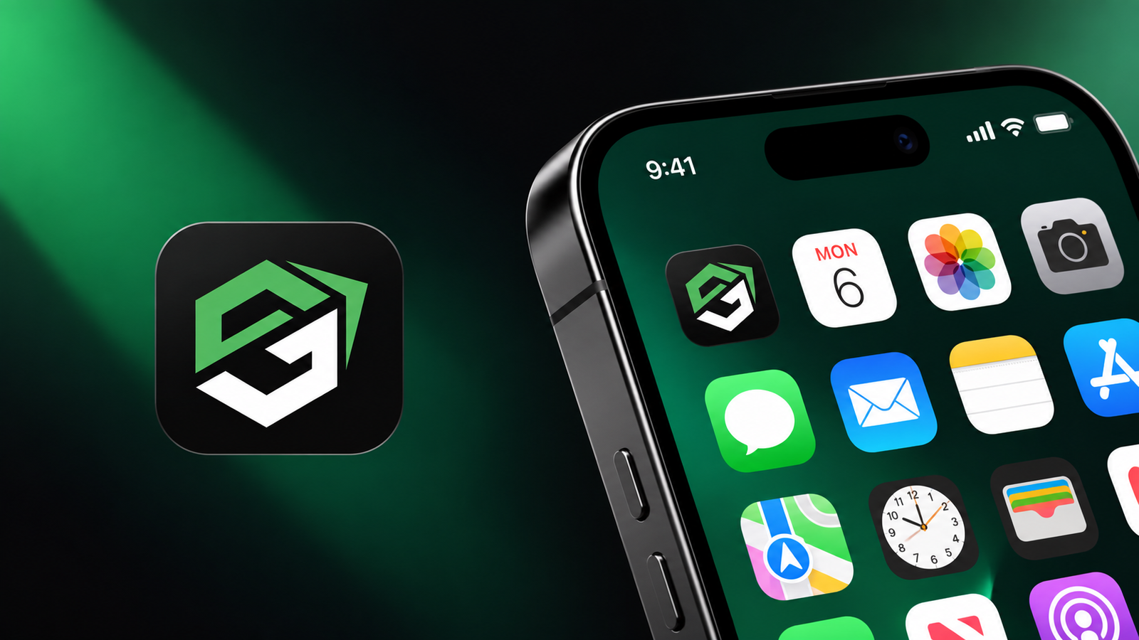
The identity was designed to work beyond the app itself.

From campaign visuals and apparel to digital touchpoints, the same visual system creates a recognizable and consistent G-Fit presence wherever the brand appears.

The Final Identity

A visual identity built to feel strong, energetic, and digital-first.

Giving G-Fit a distinctive presence across its brand, product, and marketing experiences.