Brand & Content Designer

  Logo & Branding  ›  Kaani

Kaani.

A bold visual identity for a homemade hot sauce brand with Senegalese roots.

Brand Identity
Packaging
Print
Art Direction
Kaani by Dior's Homemade
Homemade hot sauces · Columbus, Ohio
Client
Kaani by Dior's Homemade
Industry
Food & Beverage
Scope
Brand Identity, Packaging, Print, Art Direction
Deliverables
Logo, Label Design, Business Cards, Brand Mockups
Overview

Kaani is a homemade hot sauce brand built around a love for heat, bold flavor, and Senegalese roots.

The Goal

Create an identity that feels authentic to its homemade origins while giving the brand a distinctive and memorable presence.

The Approach

Bring together heat, strength, heritage, and personality into one visual system — from the logo and bottle down to every printed and digital touchpoint.

01
The Brand

Bold flavor with a
strong sense of identity

Kaani is built around a simple idea: bold flavor with a strong sense of identity.

The brand needed to feel warm and personal, reflecting its homemade roots, while still having the confidence and presence of a growing food brand.

Heat
Strength
Heritage
Personality
02
The Logo

Habanero + Lioness

“The habanero brings the heat. The lioness brings the strength. Together, they give Kaani a symbol with a story.”

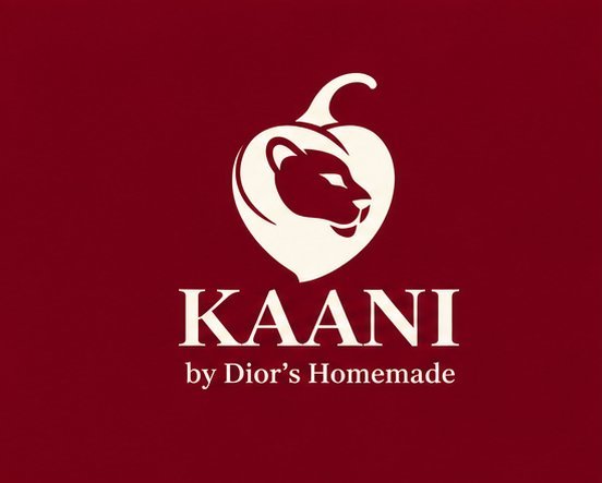
The Kaani mark combines two key ideas behind the brand: the habanero pepper and the lioness.

The habanero represents the product itself and its fiery character, while the lioness represents strength, boldness, and a connection to Senegalese identity — a symbol that feels bold, distinctive, and directly connected to the product.

Habanero
The heat
+
Lioness
The strength
The Kaani mark
03
Packaging

Where the identity comes to life

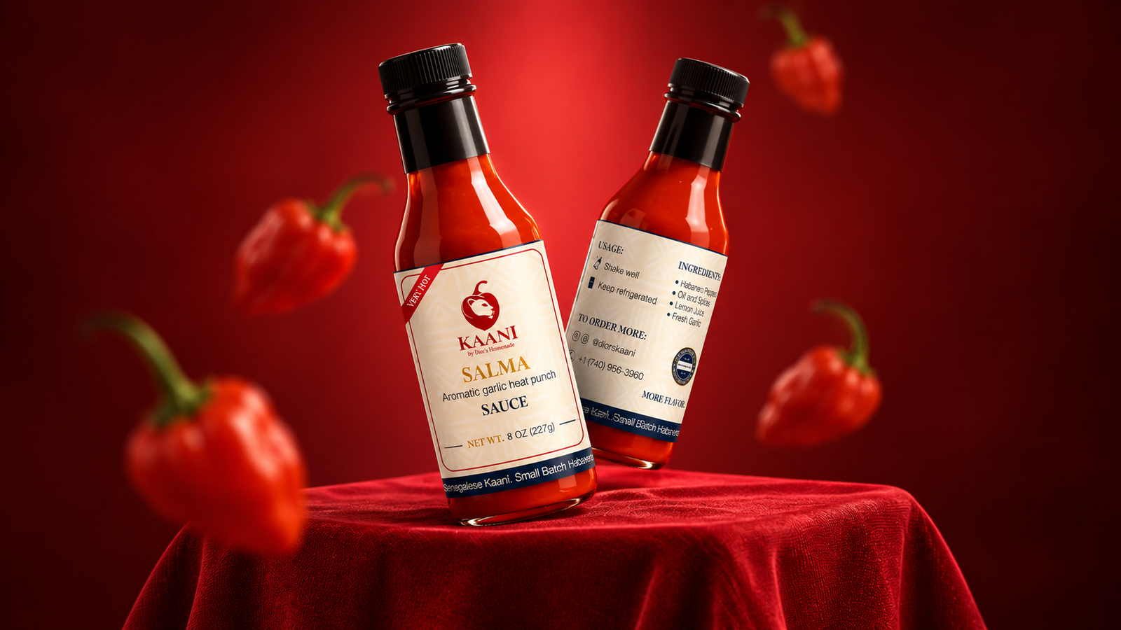
The packaging brings the identity into its most important application: the bottle — bold without becoming overly complicated.

Deep red palette
Instant heat and shelf presence.
Distinctive symbol
The mark leads every label.
Structured typography
Clear flavor and product hierarchy.
Subtle pattern
Keeps the handmade character intact.
04
Color Palette

Heat, confidence, and energy

Primary

Deep Red

Represents heat, spice, and the fiery personality of Kaani.
#760015
Secondary

Navy Blue

Adds depth, confidence, and a more premium feel.
#12223D
Accent

Yellow

Brings warmth, energy, and the vibrant character of the sauce.
#D08B3A
Base

Cream

A warm neutral that keeps it homemade.
#FCEED8

Together, these colors give Kaani a flexible visual system that can move between bold, energetic applications and more refined brand moments.

05
Typography

Heritage meets modern clarity

Headlines
Aa

Playfair Display

Brings character, elegance, and a strong editorial presence.
ABCDEFGHIJKLM abcdefghijklm 0123456789
Supporting
Aa

Helvetica Neue

Keeps supporting information clean, modern, and highly readable.
ABCDEFGHIJKLM abcdefghijklm 0123456789
06
Print Applications

Consistency beyond
the bottle

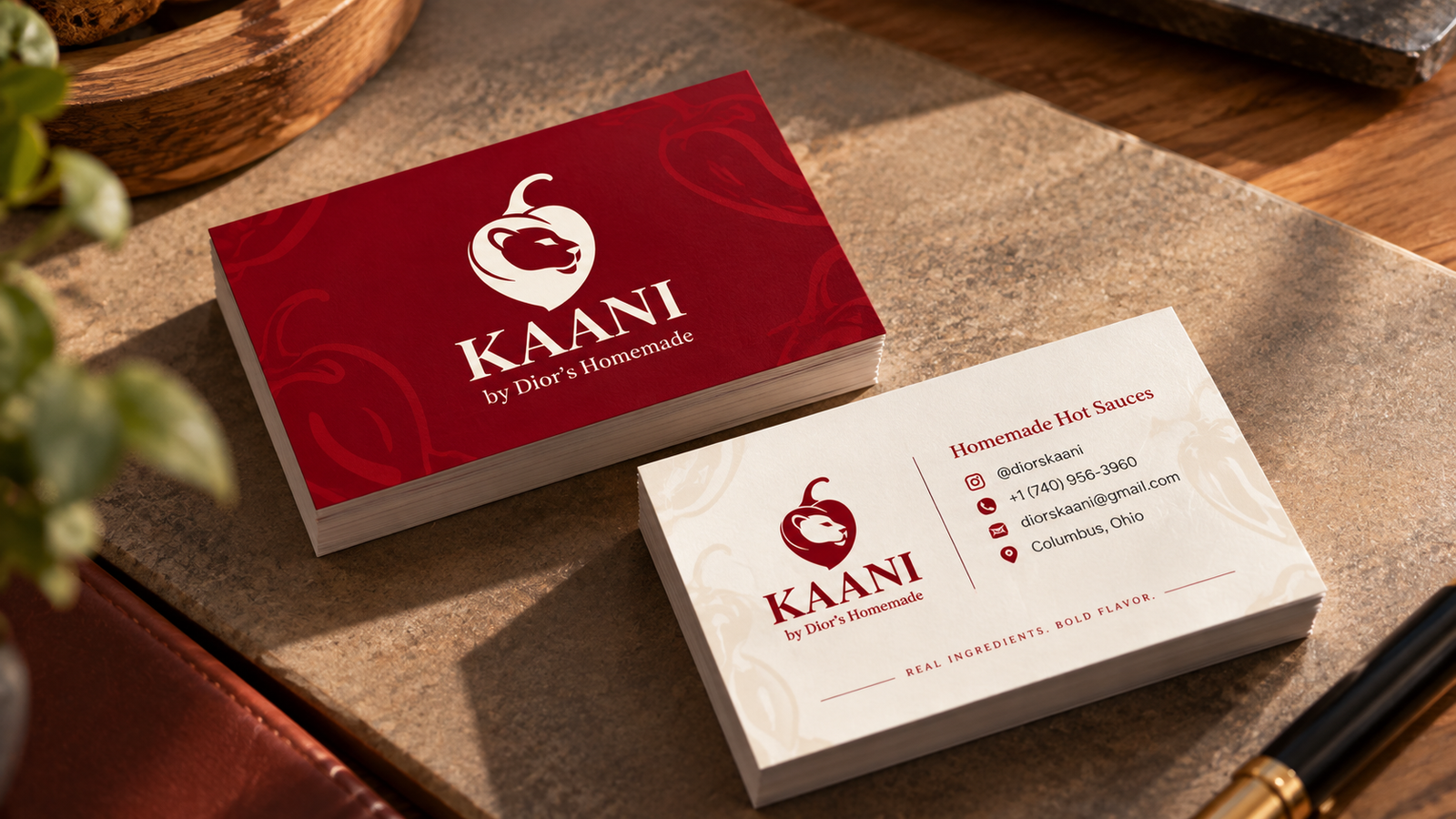
The identity was designed to work beyond product packaging.

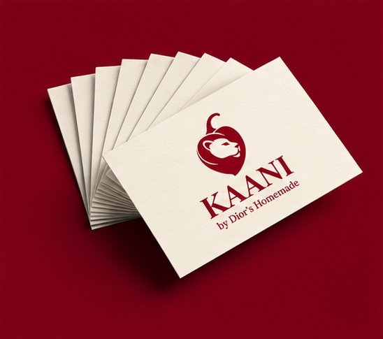
Business cards and printed materials carry the same visual language through the logo, typography, color palette, and graphic elements — keeping the brand recognizable wherever customers encounter it.

07
Brand Applications

One identity, many expressions

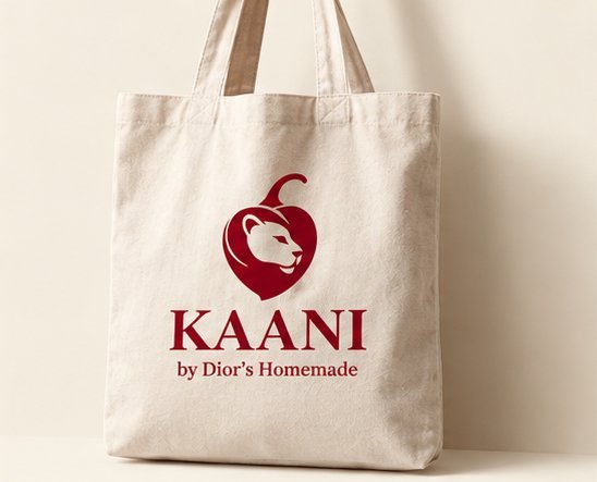
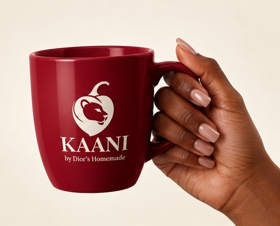
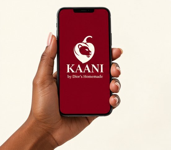
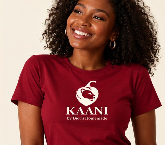
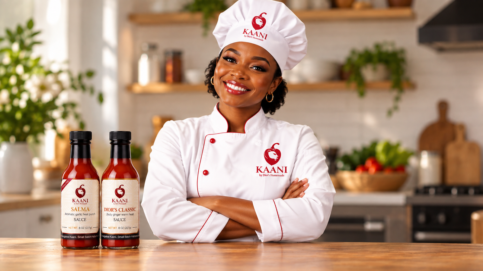
The Kaani system extends across digital, print, apparel, packaging, and everyday brand applications. From a phone screen to a T-shirt, the core elements keep Kaani recognizable.

Tote bag
Merch
Digital
Apparel
Stationery
The Result

A visual system that brings together heat, heritage, and homemade character.

From the logo and packaging to printed materials and digital applications, every touchpoint works together to tell the same story: bold flavor, strong roots, and a brand made with character.